Hi. I'm Paul, a French-born Digital Designer crafting apps and systems in London, UK. Currently Senior Product Designer at V7.

V7 Go

One year after joining V7, the company released its new product called V7 Go. As Senior Product Designer, I've been in charge of the product's design and design system. Called Mission Control, this new design system strives for better user control over the AI output by reusing existing UI paradigms for the human to AI interface.

2024

Most of the already existing ones stick to atomic components and don't go beyond. The concept behind UI Kit was to make a UI Kit actually usable for real life companies, with complex needs for technical components.

The model is built of nodes, projections and compositions. Each element has their own properties accessible from the Components Hierarchy.

UI Kit allows designers and founders to supercharge their design workflow, and to harness the full power of Figma with meticulously crafted and highly technical components.

When the user opens a composition, the Components Hierarchy panel automatically show which components are out of the view. This allows the user to drag components in this sidebar to include or exclude from a composition. This sidebar gives extra visibility and control to the user.

UI Kit handles complexity more than any other library, from complex hierarchies in tree viewers, or state management in tables, to large amount of variants for rich text editors.

To build a node, the user can either drag-and-drop the placeholder node from the toolbar or select the tool by clicking on it and clicking on the canvas to add a node. A submenu to display and switch the type of node they're building also appears.

For this UI Kit, I have carefully built dozens of exceptionally realistic interface, meticulously tailored to enable founders to get started on their project with unparalleled swiftness and ease.

To create a composition, the user activates the tool in the toolbar and click-and-drag on the canvas to create the composition. This solution allows the user to keep control over their workspace and workflow since some users may prefer to start building their compositions before building their nodes, or vice-versa.

UI Kit comprises hundreds of meticulously crafted components and thousands of their variants, ensuring an unparalleled selection that guarantees founders will discover precisely what they're looking for.

Uikit.design

UI Kit is a pixel-perfect Figma design system made for complex products. It gathers carefully crafted classic components such as buttons, dropdowns or text fields as well as more technical components such as tree viewers, rich text editors and complex tables.

2023

Most of the already existing ones stick to atomic components and don't go beyond. The concept behind UI Kit was to make a UI Kit actually usable for real life companies, with complex needs for technical components.

The model is built of nodes, projections and compositions. Each element has their own properties accessible from the Components Hierarchy.

UI Kit allows designers and founders to supercharge their design workflow, and to harness the full power of Figma with meticulously crafted and highly technical components.

When the user opens a composition, the Components Hierarchy panel automatically show which components are out of the view. This allows the user to drag components in this sidebar to include or exclude from a composition. This sidebar gives extra visibility and control to the user.

UI Kit handles complexity more than any other library, from complex hierarchies in tree viewers, or state management in tables, to large amount of variants for rich text editors.

To build a node, the user can either drag-and-drop the placeholder node from the toolbar or select the tool by clicking on it and clicking on the canvas to add a node. A submenu to display and switch the type of node they're building also appears.

For this UI Kit, I have carefully built dozens of exceptionally realistic interface, meticulously tailored to enable founders to get started on their project with unparalleled swiftness and ease.

To create a composition, the user activates the tool in the toolbar and click-and-drag on the canvas to create the composition. This solution allows the user to keep control over their workspace and workflow since some users may prefer to start building their compositions before building their nodes, or vice-versa.

UI Kit comprises hundreds of meticulously crafted components and thousands of their variants, ensuring an unparalleled selection that guarantees founders will discover precisely what they're looking for.

V7 Darwin

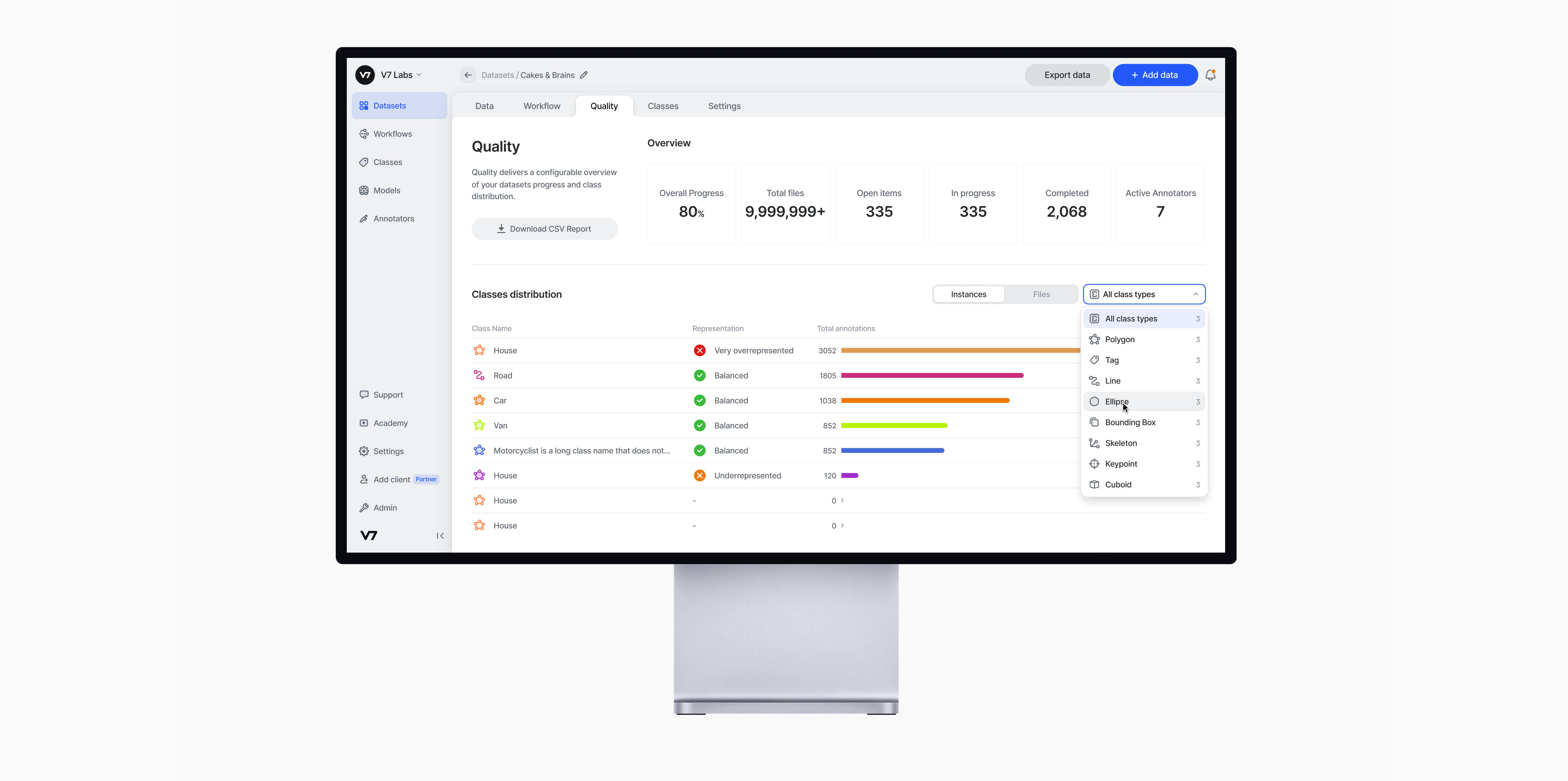
V7 Darwin is a training data platform for accelerating AI product development in a safe, cost-effective way. AI, ML, and Data Science teams at customers like Bayer, Boston Scientific, and Continental rely on V7 for training data ops, dataset management and versioning, model training and their "Human in the Loop" element.

2023

When I started working at V7, one of the main areas of focus for Darwin was to make the medical labelling experience much smoother and faster. For this, we introduced Dark Mode, True 3D, 3D Brushes and Flexible Layouts.

When the user opens a composition, the Components Hierarchy panel automatically show which components are out of the view. This allows the user to drag components in this sidebar to include or exclude from a composition. This sidebar gives extra visibility and control to the user.

As a Product Designer, I'm working on UI Systems, from designing new features, UI reskins and Design System optimization.

The model is built of nodes, projections and compositions. Each element has their own properties accessible from the Components Hierarchy.

As the owner of the Design System, I've been regularly updating components to use the latest Figma features. I'm also responsible for creating documentation for new components so that the usage is consistent.

To build a node, the user can either drag-and-drop the placeholder node from the toolbar or select the tool by clicking on it and clicking on the canvas to add a node. A submenu to display and switch the type of node they're building also appears.

I'm also responsible for designing new features or reskins of existing features.

Arro

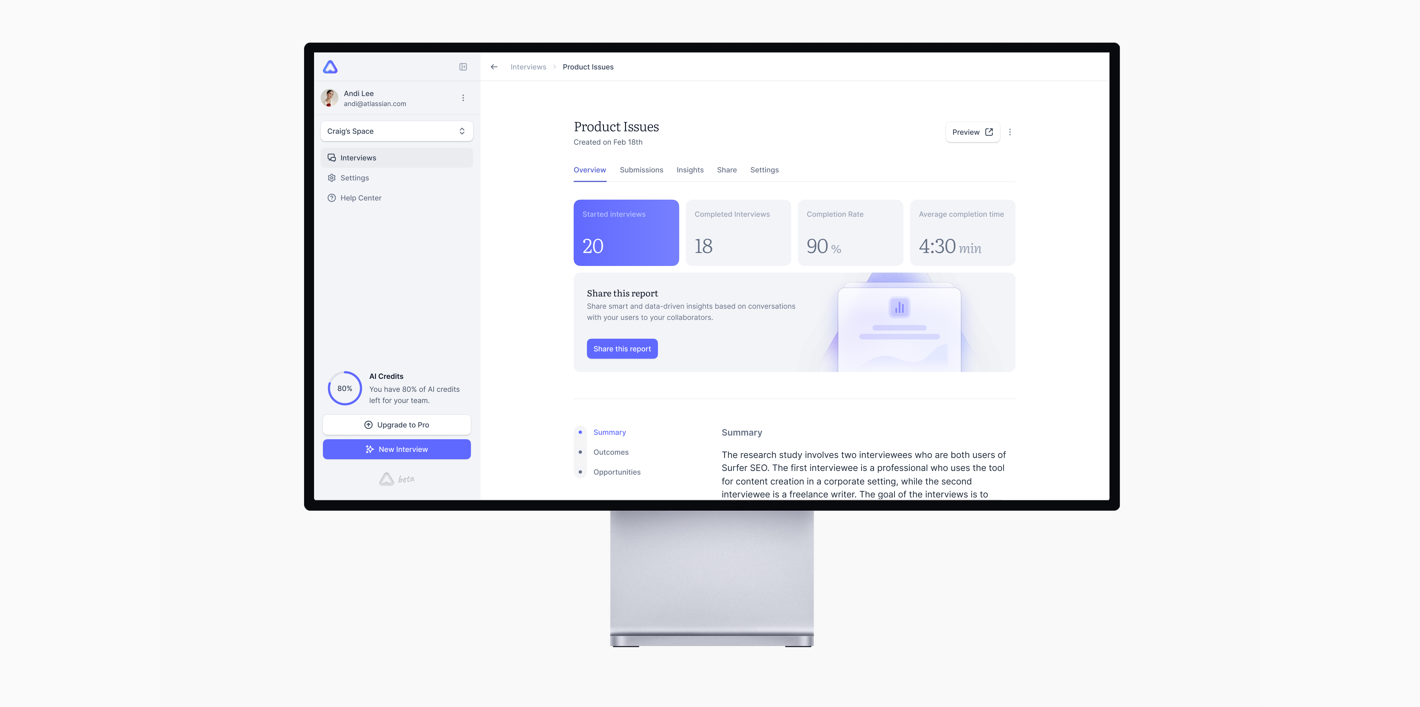
Arro is an AI-Powered User Research Assistant. After raising a Pre-seed Round, their founders invited me to join the adventure as Founding Designer. I've developed and now own the brand and product design, as well as the brand's design system.

2023

As Founding Designer, part of my role is also to develop marketing materials for the brand development, like this video introducing the Previews feature.

When the user opens a composition, the Components Hierarchy panel automatically show which components are out of the view. This allows the user to drag components in this sidebar to include or exclude from a composition. This sidebar gives extra visibility and control to the user.

The submissions table allows Researchers to quickly scroll through summaries of the discussions that happened between users and the AI assistant

The model is built of nodes, projections and compositions. Each element has their own properties accessible from the Components Hierarchy.

We've developed a discussion experience optimized for focus and sharing through subtle animations and interactions, available from desktop to mobile devices.

To build a node, the user can either drag-and-drop the placeholder node from the toolbar or select the tool by clicking on it and clicking on the canvas to add a node. A submenu to display and switch the type of node they're building also appears.

Arro provides an overview for each interview that highlights a summary of all the discussions, a list of answers to specific outcomes, and a list of opportunities identified by the AI Assistant.

Ollie

Founding Designer of Ollie, an app for online, on-site ordering in bars and restaurants. Designed the brand, the user’s mobile app and the restaurant’s management iPad app.

2020
3 iPhone mockups of the Ollie app showing the homepage, the user's cart and a restaurant's details.

The UI and brand are intended to be neutral in order to integrate with a maximum of restaurants and to highlight their dishes through photos.

The Ollie logo

The brand is intended to be neutral, yet it retains a refined and modern identity through the subtle details of the design.

iPad mockup of the restaurant's management UI showing how to set up restaurant's timetable

The restaurant interface is mainly designed for tablets. It includes some components whose UX is complex like the system of editing the opening hours.

iPad and iPhone mockups showing the sign in page and a restaurant's details

The interface follows the design guidelines of each device and OS to benefit from an optimal integration in native language and usual interactions.

MetaCell Cloud

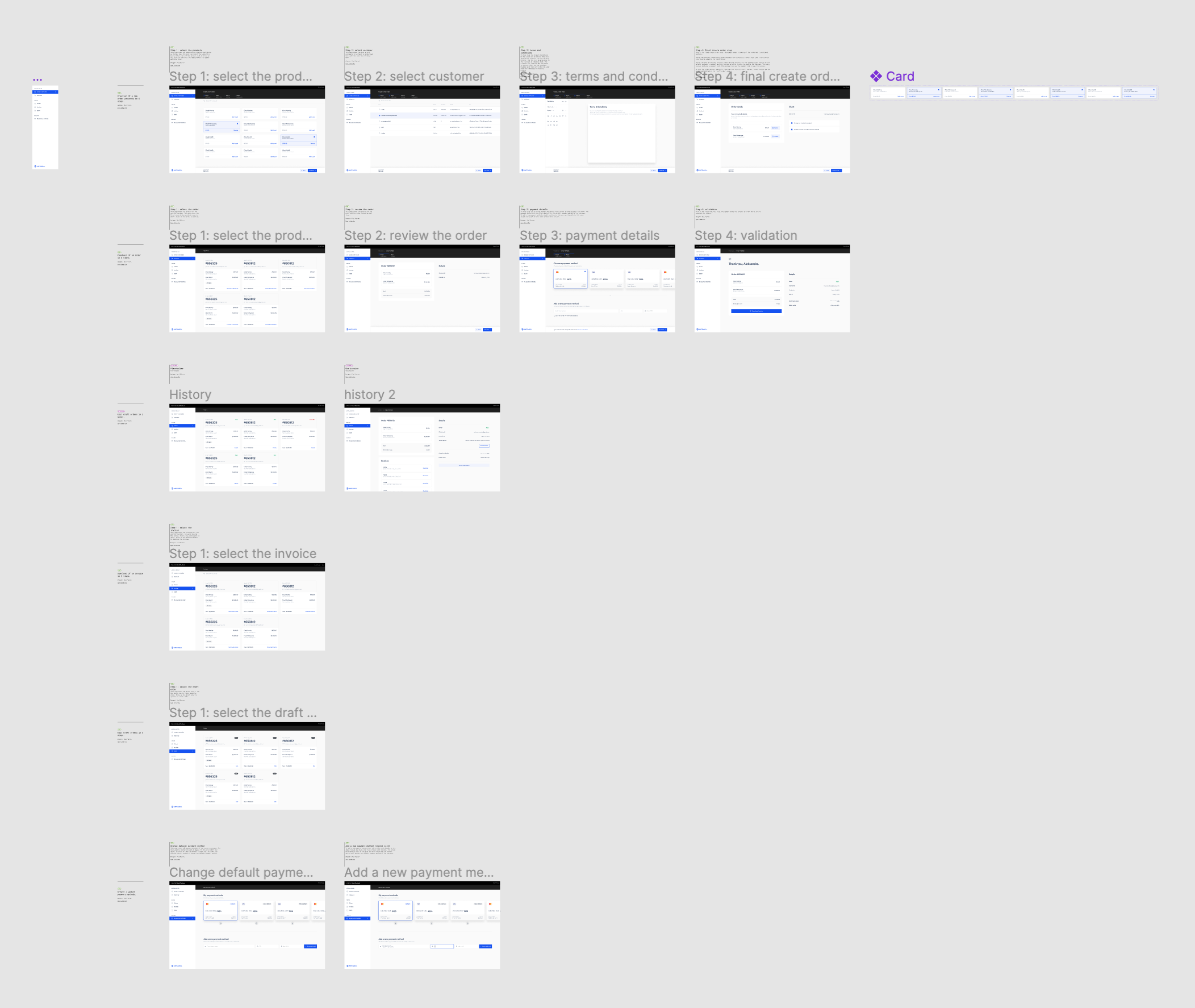
MetaCell Cloud is the suite of products powered by MetaCell. For building those products more efficiently and quickly, I led the creation of MetaCell Design System, our in-house design system based on our brand.

2020
Abstract cover graphic of the MetaCell's design system

As part of the rebranding we operated in 2021, we also created a new design system for our in-house products. As Lead Designer, I had the responsibility to collaborate with engineers and product teams in order to build a useful and scalable design system.

A mockup showing the MetaCell Cloud Checkout UI for writing custom terms and conditions

The UI uses different shades of dark and light grey in order to create structure and architecture in the design. The advantage of this system is that it can be replicated for all the apps of the suite in order to create unconscious content architecture across the products.

A screenshot of the Figma UI showing the consistency of the design system across different views

When zooming-out, the structure reveals its advantage in creating a consistent layout that can be reused across the views and products.

A mockup showing the MetaCell Cloud Hosting UI where the user is having a consultation with their Software Engineer

MetaCell Cloud Hosting offers a support center where users can discuss with technical support team members. This very-specific view also uses the structural layout and design system elements.

Confidential work

There's more. But it's confidential so you will need the password. If you're interested in seeing work I've done for Natus Medical, the Salk Institute or Javelin Biotech, feel free to reach out and I'll be happy to show you.